Friday, December 25, 2015

The Statue Got Me High, Part 2

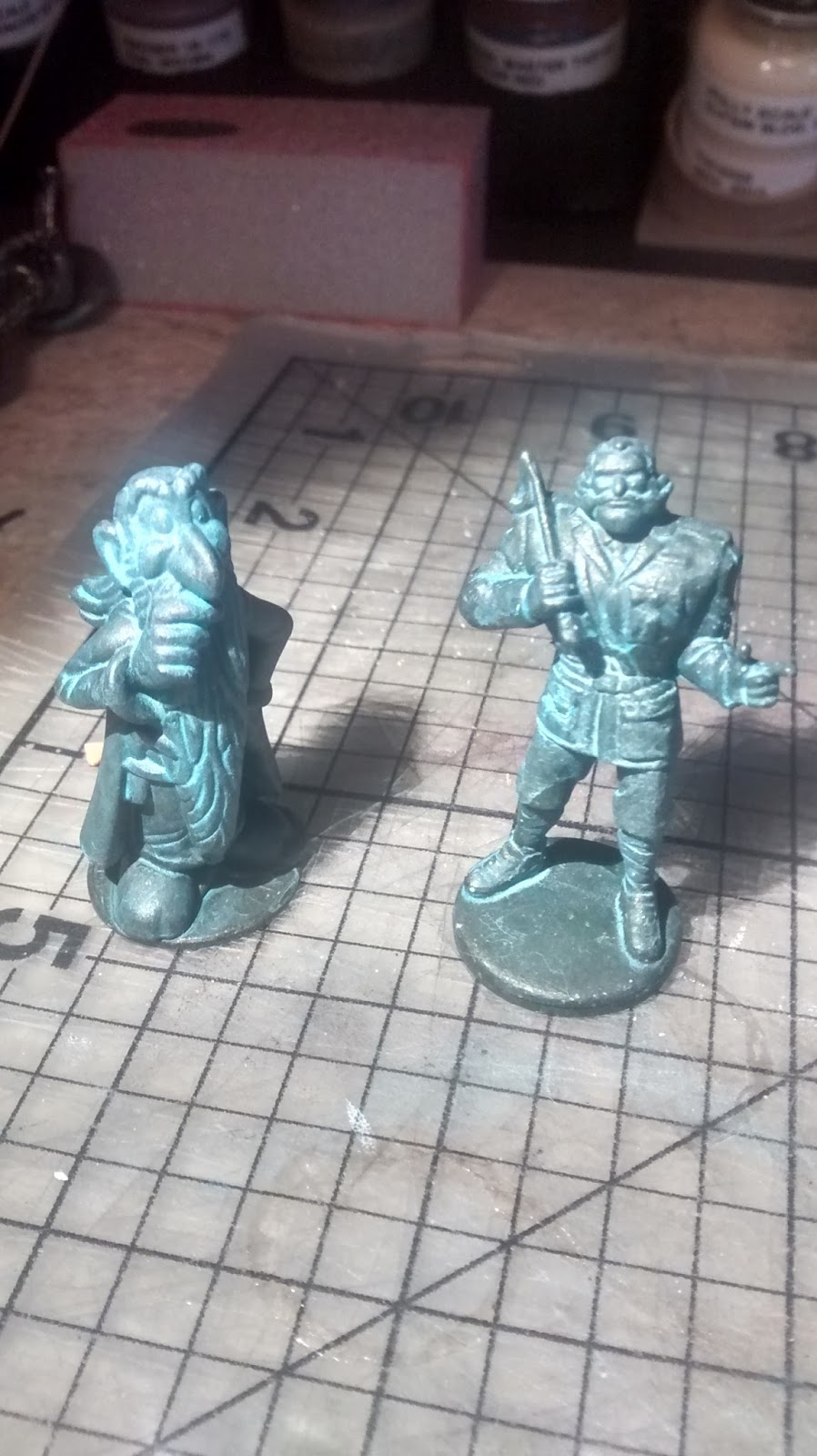
I think I have the colors just right now...


The figures: A Kinder Surprise toy of Getafix (from the Asterix comic books) and two Clue Master Detective figurines, Colonel Mustard and Prince Azure.
The base: bits of chipboard, painted pink-ish to simulate the stone base of the statue I'm replicating for my client.

Primer coat: cheap rattle-can black from Home Depot.

Base coat: FolkArt Sap Green, mixed with a bit of DecoArt Rich Espresso metallic and a few drops of black craft paint. Thinned with a little Windsor & Newton Flow Improver.

Patina: DecoArt Desert Turquoise, thinned with a little flow improver and a lot of distilled water. (I tried using alcohol, as per a couple online instructions, but I ended up with the alcohol fusing with the pigment and making a horrible phlegmy blob in the bottom of the bottle.) I gave the statues two coats of patina, making sure a lot of it settled into the folds and crevices of the figures.
 I really like how Getafix turned out. He looks like something from Discworld.

Tuesday, December 22, 2015

The Statue Got Me High

Well, not really. But I have been thinking about how to make a statue for a client's layout for a while, and today I tested some paints, and I think I've got it.

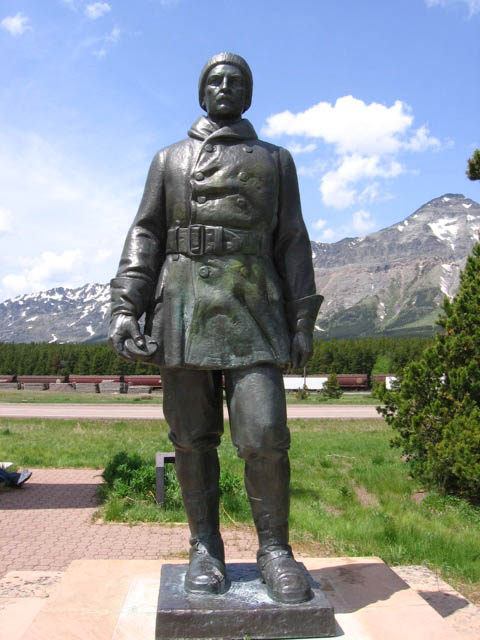
Here is the statue the client needs:


It's John Stevens, the man who surveyed the route that eventually became part of the Great Northern Railroad line.

My client's layout is HO scale, so my thinking was, I can use an O scale figure, and it would be "larger-than-life" compared to an HO scale figure... just about the right size of 10 HO scale feet tall. If you compare the size of the pointing fellow to the size of Stevens, the ratio sure looks to me like HO to O.

The question was, what figure to use? I searched everywhere for mountain men, fur trappers, hunters, native Americans... anything that might come close to replicating that outfit, but I came up with nothing that was going to work.

Then one day, I got a bright idea. What about fighter pilots?

Here's a different view of  the sculpture...


...and get a load of this WWI British pilot! He's in practically the same pose!


I'll have to modify or replace his head, but otherwise, it's a really good match, and it's 1/48th scale, which is standard USA O scale. Even though we won't be building that part of the layout for months, I ordered him today, since cottage companies like The Model Cellar tend to go under with no notice. 

Anyway, today I got a bee in my bonnet about testing out some painting and weathering techniques for this statue, and so I went to the craft store to pick up some cheap bronze and turquoise paint. Then I went home and dug around in my gaming box for some board game figurines I've used as tokens for Cheapass Games. I grabbed a Homies figurine of a mariachi violin player, sprayed him matte black with a rattle can, gave him two coats of bronze and a wash of thinned turquoise, and came up with this.

The base is three squares of chipboard, toughened up with a bit of super glue, painted with two shades of Badger concrete and weathered with india ink in isopropyl alchohol. I think for the final model, I'll darken that bronze paint with quite a lot of dark green, but apart from that, I think I've got it.

Sunday, October 25, 2015

Gorre & Daphetid diorama in N Scale, Pt 1

I just started working on a diorama based on the Cross Junction / Corsa area of John Allen's Gorre & Daphetid railroad. I bought the plans from Silver Ridge Modelworks. It's available as either an HO-scale laser-cut kit, or you can just purchase the instructions and the templates, and build it yourself from scratch in whatever scale you want. My plan is to take the templates and apply Clever Models textures with The GIMP to make an N scale version of the depot, and install it in a diorama which is similar to the original G&D scene.

Here is the diorama suggested by Silver Ridge...


...and here is how the station looked in the original G&D setting.


You can see that Allen had a tunnel perpendicular and under the upper track. I decided to put that in.

I threw together a quick, corrugated and chipboard dummy in three dimensions to see what the proportions might look like. This gives me some planning flexibility, because I can move the station around, and I'll have an idea what works and what doesn't.

This is what it looked like after a couple hours.


I converted the measurements for the diorama down to N from the Silver Ridge plans, but when I got to the station, I used no measurements at all -- I just hacked away at the chipboard and slathered the edges with Aleene's Tacky Glue. If someting was too big, I chopped it off. If it was too small, I tore it off and made a bigger piece. It's a bit like sketching with a pencil and erasing whatever looks wrong. It's a lot of fun, and the whole process only took a couple hours. Possibly 90 minutes. I'm having trouble estimating the time spent, because I was "in the zone" the whole time.

The following evening, I threw together a very rough cityscape, similar to the G&D original, but a little more urban. I'll use forced perspective to fit that skyline in the very limited space, and the buildings in the front may need to be a little smaller than N scale.


Overhead shot.

I can already see I'll have to lower the skyline about 1/2 to 3/4 of an inch, because I don't like the proportions. Also, I'll modify that cross street so the back of it is hidden a bit better.

The upper deck of this should have a streetcar, while the lower station will provide passenger and freight service.

Wednesday, October 21, 2015

Happy BTTF Day!

Here are a few random thoughts about my favorite joke in the Back to the Future series, the scene where Doc Brown apologizes for the crudity of his incredibly elaborate model of Hill Valley's town square, which he apparently just threw together really quickly, using lunch pails, salt shakers, ketchup bottles, egg cartons, etc.

"I didn't have time to build it to scale or paint it." 

The joke works for me on multiple levels.

As a scale structure builder, I know how much effort went into that tabletop model. It probably took several prop builders a couple days to put that damn thing together.

It's a joke about the selective compression of, you know, TIME in movies. Because we don't actually see Doc working on the model, we just think, "Some time passed while he built that model." But the model is really too complex for the unshown time, which tickles me.

Marty is a little stunned by how detailed the model is, and how nuts Doc would have to be to think it isn't good enough. Because he likes Doc, and wants to reassure him it's okay, there's a little nice relationship interplay in the exchange...

Doc: "Let me show you my plan for sending you home. Please excuse the crudity of this model. I didn't have time to build it to scale or paint it."

Marty: "It's good."

Doc: "Oh, thank you. Thank you."

Doc actually did paint everything off-white, which would be even more time-consuming than just gathering all the elements and setting them on the ping-pong table. In true boffin style, Doc thinks his explanation would be clearer if he added much, much more detail. But if the prop makers hadn't painted everything one color, the image would have been too cluttered, and the wind up car and wristwatch wouldn't have popped against the neutral background.

It's great foreshadowing. Doc builds a model to demonstrate how every little detail has to be just perfect, and the wind-up car catches fire and flies off the table. This creates a nice bit of suspense later, because if Doc couldn't even get a demonstration to work...

In BTTF III, it's a nice callback to the first movie. Because events repeat themselves in the films, Marty knows the drill by now...

Doc: "Marty, once more let's go over the entire plan and layout. I apologize for the crudity of this model, but I just..."

Marty: "Yeah, I know, Doc, it’s not to scale. It’s okay, Doc."

Doc: "Alright."


I love the plausibly (and improbability) of Doc quickly making these made from 1885 items. Doc is a blacksmith, so it makes some sense he'd fabricate a miniature Delorean from sheet tin and bullet casings. Since 1885 pre-dates model railroading, he has to build the train out of whatever is at hand -- part of a corncob pipe, spools, revolver parts. Again, notice how nicely these props read -- the bodies are all dark brown/black parts, while the details are lighter-colored wooden parts. "TIME MACHINE" is written in white, so Clara can't possibly miss it when she comes upon the scene.

I realize there is no "I-apologize-for-the-crudity-of-this-model" scene in BTTF II, the very film we're celebrating today. BTTF II is my least favorite of the three movies, as it's a confusing mess. The lack of a model of Hill Valley in BTTF II might even contribute a little to my disliking it.

As long as I'm ranting about BTTF, My theory about the trilogy is: the construction is musical -- BTTF I is the presentation of the theme; BTTF II is a fugue with variations on the theme; and BTTF III is the pastoral. 


Sunday, September 6, 2015

Build Your Own Working Clock Out of Paper


I'm trying to finish this kit I set aside years ago for the PDX Mini Maker Fair next weekend. I like to challenge myself and have a new showpiece or two every year.

Sunday, August 30, 2015

Font Abuse at the NMRA show.

I quite liked a lot of the models at this exhibitor's booth at the National Model Railroad Association's show at the PDX Expo Center this weekend, but this particular roof stood out as the most egregious bit of font abuse I saw all day...

 COMIC SANS!?

How could you spend all that time designing, building and detailing that building and then just slap COMIC SANS on it?

(UPDATE 5/22/16: I found a copy of Typography for the People: Hand-Painted Signs from Around The World (Plus 15 Free Fonts) by Daniel Bellon at a thrift store for under $5. I modified the image above with a font called Bellon Square, which has the kind of letters that might actually be used by someone who hand-paints signs like this...)


I have a few rules about fonts for model structures...

FONT RULE #1: Don't Use Comic Sans.
(There are lots of other fonts you shouldn't use on structure models, but just never use Comic Sans for anything, ever.)

FONT RULE #2: 
Don't Confuse Print or Screen Fonts with Signage Fonts.
(Print fonts are designed so the ink won't blob up where the lines join. Screen fonts are designed to look nice on your computer. Signage fonts are designed to be read and understood instantly at a distance.) 


FONT RULE #3:
Use All Caps.
(Names of businesses were almost never set in upper and lower case.)
EXCEPTION TO FONT RULE #3: 
Don't Use All-Caps With Script or Old English Fonts.
(Unless you're getting a prison tattoo or recreating modern graffitti.) 

 Old English set in all caps is a hallmark of
Southern Californian Chicano culture, 
but isn't appropriate for signage.
(By the way, I really like this!)


FONT RULE #4: 
Don't Use a Curved Baseline to Make It Look "Old Time-y."
(Most old signs on buildings were designed to be legible at a distance, not fancy. Curved baselines were mostly used in print and on packaging, and only very, very seldom on signs. I love Bar Mills models, but they get this wrong consistently.)

This is an authentic, vintage curved baseline, from a 
Sanborn Map, which would be really difficult to recreate,
and would never appear on the side of an actual building.

This is an ugly example of using a curved 
baseline to make something look old time-y.
 A Bar Mills model. A fine-looking structure,
but the font is a print font, and there's a curved
baseline on the 2nd"Amos Cutter", and again on
"General Merchandise." Don't try too hard to make
something look old fashioned!

 
FONT RULE #5
Don't Stretch a Line of Text to Make It Fit
(This changes the line weights, and makes the letters look all wrong. If you stretch side-to-side, the downstrokes get thicker; up-and-down stretching thickens the horizontal lines. Look for fonts that fit the space you want to fill without distortion.)
FONT RULE #5a
Don't Stretch Pictures, Either. 
(I wrote about this, here.)


FONT RULE #6:
The Fonts You Want: Sign Painter's Egyptian and Various Slab Serif.
(I've yet to find the former in a free font format, so I cut-and-paste from scans I've found online. The line weight doesn't change where the lines meet, and the reason for that is the technique sign painters used to paint letters: by rotating the brush as they went along. This makes the line weights different from calligraphic fonts, where the nib of the pen is typically held at the same angle while the letter is drawn, creating thick and thin lines. Slab Serif or "Block" fonts are used nowadays mostly for collegiate sports, but they were used for signs in the early 20th century.)  


FONT RULE #6:
Read Antique Sign Painters' Guidebooks.
(See above.)


FONT RULE #7: 
Signage from the Late 19th Century Always Ended with a Period.
(I don't know why; it just did. This trend lasted until about the 1920s. See the quote below, from Elements of Lettering and Sign Painting, 1899...) 


FONT RULE #8: 
Do Look at a Lot of Old Photos. 
(Any book from Arcadia Publishing is a good starting point. Arcadia's books are photo-heavy, so you will almost certainly find examples of signs from whatever era you're modelling. As a bonus, they'll be specific to the area you're building.)

FONT RULE #8a
There Were a Lot of Sign Painters Who Didn't Know the Rules.
I'm forever finding old photographs of really bad signs. Zoom in on the sign on the mill, and you'll see the letter spacing is so bad, it reads "ILWACOMILL &LUMBERCO." Y'know, I think it would be okay to redesign that sign, even if it is a change from the prototype. That sign painter didn't know what the hell he was doing.


Just because a sign painter got it wrong, you don't have to...

FONT RULE # 9:
There Are Lots of Free Fonts Out There. Go Get Some!