Showing posts with label architectural model. Show all posts

Sunday, November 25, 2018

Clever Models Gateman Tower, Test Fitting Sub-Assemblies

I am 5/8ths done with the upper tower walls and windows. 


Here's what I have so far, roughly balanced together in order to see if I've screwed anything up.


My original plan was to light the inside, but at this point, that's too much of a hassle. I did sandwich a layer of black cardstock between the outer and inner surfaces, so if I do light it later, the light won't shine through the walls.

Sunday, August 30, 2015

Font Abuse at the NMRA show.

I quite liked a lot of the models at this exhibitor's booth at the National Model Railroad Association's show at the PDX Expo Center this weekend, but this particular roof stood out as the most egregious bit of font abuse I saw all day...

 COMIC SANS!?

How could you spend all that time designing, building and detailing that building and then just slap COMIC SANS on it?

(UPDATE 5/22/16: I found a copy of Typography for the People: Hand-Painted Signs from Around The World (Plus 15 Free Fonts) by Daniel Bellon at a thrift store for under $5. I modified the image above with a font called Bellon Square, which has the kind of letters that might actually be used by someone who hand-paints signs like this...)


I have a few rules about fonts for model structures...

FONT RULE #1: Don't Use Comic Sans.
(There are lots of other fonts you shouldn't use on structure models, but just never use Comic Sans for anything, ever.)

FONT RULE #2: 
Don't Confuse Print or Screen Fonts with Signage Fonts.
(Print fonts are designed so the ink won't blob up where the lines join. Screen fonts are designed to look nice on your computer. Signage fonts are designed to be read and understood instantly at a distance.) 


FONT RULE #3:
Use All Caps.
(Names of businesses were almost never set in upper and lower case.)
EXCEPTION TO FONT RULE #3: 
Don't Use All-Caps With Script or Old English Fonts.
(Unless you're getting a prison tattoo or recreating modern graffitti.) 

 Old English set in all caps is a hallmark of
Southern Californian Chicano culture, 
but isn't appropriate for signage.
(By the way, I really like this!)


FONT RULE #4: 
Don't Use a Curved Baseline to Make It Look "Old Time-y."
(Most old signs on buildings were designed to be legible at a distance, not fancy. Curved baselines were mostly used in print and on packaging, and only very, very seldom on signs. I love Bar Mills models, but they get this wrong consistently.)

This is an authentic, vintage curved baseline, from a 
Sanborn Map, which would be really difficult to recreate,
and would never appear on the side of an actual building.

This is an ugly example of using a curved 
baseline to make something look old time-y.
 A Bar Mills model. A fine-looking structure,
but the font is a print font, and there's a curved
baseline on the 2nd"Amos Cutter", and again on
"General Merchandise." Don't try too hard to make
something look old fashioned!

 
FONT RULE #5
Don't Stretch a Line of Text to Make It Fit
(This changes the line weights, and makes the letters look all wrong. If you stretch side-to-side, the downstrokes get thicker; up-and-down stretching thickens the horizontal lines. Look for fonts that fit the space you want to fill without distortion.)
FONT RULE #5a
Don't Stretch Pictures, Either. 
(I wrote about this, here.)


FONT RULE #6:
The Fonts You Want: Sign Painter's Egyptian and Various Slab Serif.
(I've yet to find the former in a free font format, so I cut-and-paste from scans I've found online. The line weight doesn't change where the lines meet, and the reason for that is the technique sign painters used to paint letters: by rotating the brush as they went along. This makes the line weights different from calligraphic fonts, where the nib of the pen is typically held at the same angle while the letter is drawn, creating thick and thin lines. Slab Serif or "Block" fonts are used nowadays mostly for collegiate sports, but they were used for signs in the early 20th century.)  


FONT RULE #6:
Read Antique Sign Painters' Guidebooks.
(See above.)


FONT RULE #7: 
Signage from the Late 19th Century Always Ended with a Period.
(I don't know why; it just did. This trend lasted until about the 1920s. See the quote below, from Elements of Lettering and Sign Painting, 1899...) 


FONT RULE #8: 
Do Look at a Lot of Old Photos. 
(Any book from Arcadia Publishing is a good starting point. Arcadia's books are photo-heavy, so you will almost certainly find examples of signs from whatever era you're modelling. As a bonus, they'll be specific to the area you're building.)

FONT RULE #8a
There Were a Lot of Sign Painters Who Didn't Know the Rules.
I'm forever finding old photographs of really bad signs. Zoom in on the sign on the mill, and you'll see the letter spacing is so bad, it reads "ILWACOMILL &LUMBERCO." Y'know, I think it would be okay to redesign that sign, even if it is a change from the prototype. That sign painter didn't know what the hell he was doing.


Just because a sign painter got it wrong, you don't have to...

FONT RULE # 9:
There Are Lots of Free Fonts Out There. Go Get Some!

Sunday, August 23, 2015

Tuesday, July 21, 2015

Gorre Engine House in N Scale, Part II

7/20/15

Only had a couple brief moments today to work on this: in the morning as my wife fixed breakfast, and again this afternoon after I'd done the grocery shopping. Managed to cut holes for the windows along the back wall and install the windows, and to make and install six more window frames (without the transparencies) for the interior. Pics to follow.

7/21/15

Had a little over an hour in the morning. Treated some trim pieces with CA glue, laminated and cut openings in one entrance, added the round and rectangular windows, then dry-fitted what I had so far.


NOTE TO THOM: slight correction needed -- the door on the wall with the round window needs to have the trim added around the rectangular window and the door frame. If I cut out the white areas as printed, the holes would be the size of the door and window frames, rather than the size of the door and window. My window sub-assembly nearly fell through the hole.

Sunday, July 19, 2015

Clever Models Gorre Engine House in N Scale, Day 1

Spent most of the day working on these windows for the Clever Models Gorre Engine House. I still need to make the interior trim (because this is a building you can see into) and the skylights. I decided to work on windows first, because I was experimenting, and I wasn't sure how they would turn out -- I didn't want to be nearly finished with the building and have no way to make decent windows.

Penny for scale.

The mullions are inkjet printed on transparency film, while the trim is cardstock which I soaked in cyanoacrylate before cutting. This made it easier to avoid overcutting because the cardstock is a little tougher and more like plastic. 

While the building would look better with several windows open, I decided that one was enough, because it was really difficult to do. 

My new Glue Looper tools proved very useful today. They're little doodads that fit in an X-Acto handle and give you a tiny metal loop you can use to transfer CA glue to tiny spots. I clamped the transparencies to the frames with wee clothespins, dipped the Glue Looper into a drop of CA, gently touched the edge of the transparency -- and just the right amount of glue seeped between the parts through capillary action. Slick!

I stopped shortly after taking this photo because the CA was misbehaving as I soaked window frames, and it began dripping onto my workspace. It was just a matter of time before I glued my fingers together, which, surprisingly, I didn't do all afternoon. Thank you, Glue Looper!

Thursday, January 29, 2015

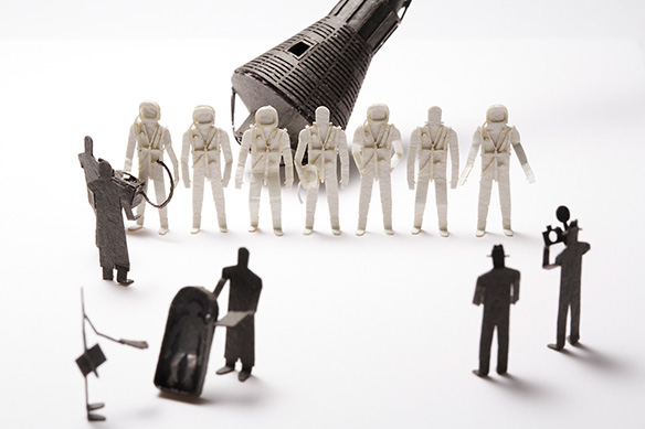
1/100 Scale Japanese Die-cut Architectural Model Accessories

There are a lot of really nice models here, but I particularly liked this one. Most of the Mercury astronauts are completely interchangeable, except one of my heroes down in the lower left -- it's Ham the Space Chimp!


Friday, January 16, 2015

Stereoscopic N Scale Hotel Railing

Just started experimenting with toughening up paper using thin cyanoacrylate. This allows me to cut very, very fine detailed parts without the cardstock delaminating. Here's a balcony railing from an Old-West type building.

I came up with a technique for curing the the cyanoacrylate quickly. I hold the uncut piece in one of the clamps of my Helping Hands tool, and apply the thin super glue along the back of the paper, so it wicks in. Then, because the catalyst that makes cyanoacrylate set is moisture, I just put a steaming cup of water under the piece, and let the rising vapors do the work. 30 seconds or so, and it's ready.

 If I don't do this, I've found myself looking at the piece stuck to my finger.

Wednesday, January 14, 2015

Stereo Views of the Small Brick Machine Shop

Finally got a new battery in the better camera, so here are some slightly-better-than-before stereoscopic shots to document the Clever Models Small Brick Machine Shop build.

As usual, these images are for free-viewing, not cross-eyed. US penny for scale.


Monday, January 12, 2015

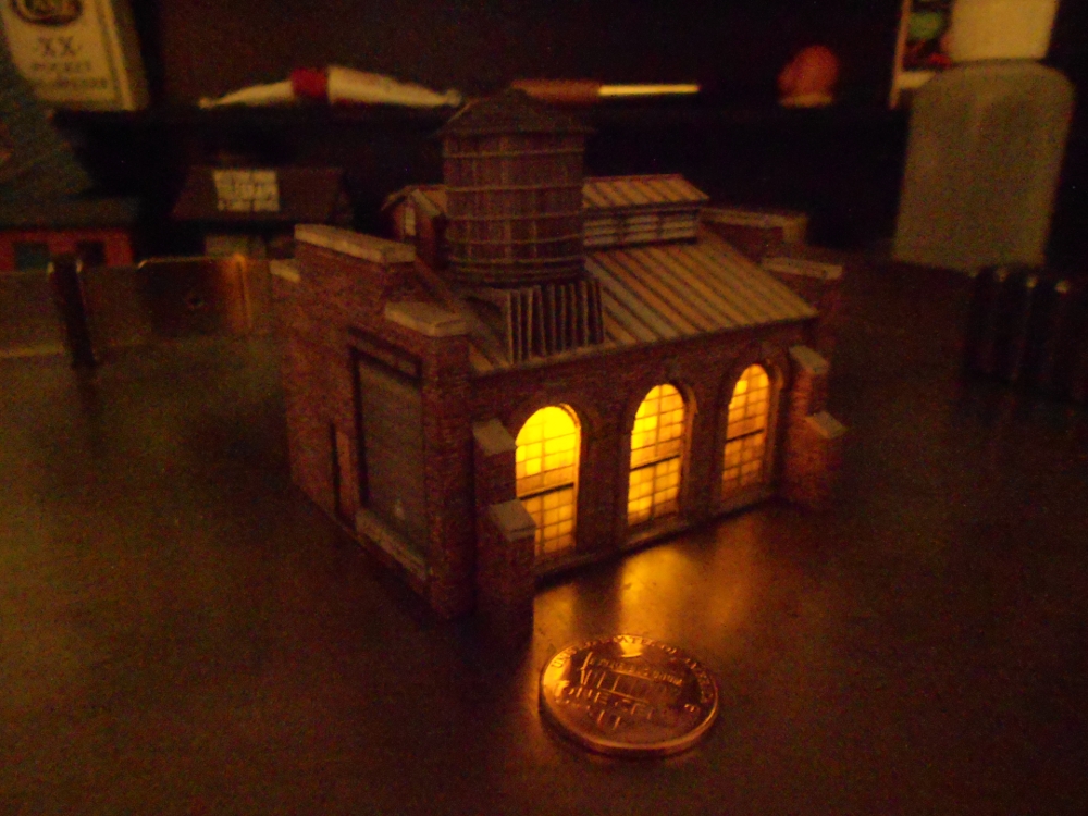
Clever Models Small Machine Shop in N Scale -- COMPLETED!

I'm pleased with how nicely this building from Clever Models turned out. The supports for the water tank are a little wonky, but not too bad.


Here it is with a Dollar Store tea light LED in it. The flicker makes it look as if someone is using a forge or welding.


Big Miniatures YouTube Playlist

I've made a YouTube playlist consisting of around 3-1/2 hours of video of really large architectural miniatures. I consider some of these large because they're large scale, while I include others because they sprawl all over the place. There's everything from British miniature villages to the Langweil model of Prague to Applied Imagination's inspiring buildings made of natural material.

And of course, I had to include one of my favorites: The Storybook Land Canal Boats from Disneyland, which I've loved since childhood.


Sunday, January 11, 2015

Water Tank on N Scale Machine Shop

I'm moderately happy with how this turned out -- the supports are a little cattywampus, but they're pretty good for N scale.

I modified some of the support parts using the GIMP. The original model had the L-shaped support pieces as two separate pieces to be glued together, and there was absolutely no way that would work at this scale.

This model will be done in the next couple of days. Almost all the sub-assemblies are finished, except for a simple side building and a vent or two. It should come together quickly once I finish those.

I brought this model along with me on a holiday trip, and stashed all the finished parts in a small box in my carry-on luggage. Card models are tougher than you might think!

Thursday, January 8, 2015

Clever Models Small Machine Shop in N Scale

I'm about midway into this build. It's tough working this small.

I printed the windows on transparency film, and I'm laminating many parts onto black, heavy cardstock. I hope I can put an LED inside and have it lit from within, with no light leaks at the seams.

I still have to make a side building and finish a water tank that's about the size of a toothpaste cap.


Since it's a machine shop, I named it "BARTOS Mensch-Machine-Music" after Karl Bartos.

More Stereoscopic Documentation of Builds

Just doing a few more stereoscopic shots of some of my builds. These both happen to be N scale. The first is the Bates House from Psycho (free download here), the second is the Bulldog Cafe.

Views are all for free-viewing, not cross-eyed.


Tuesday, January 6, 2015

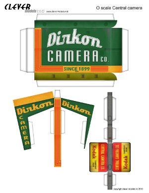
Clever Models Central Camera Mods

I'm actually building something else at the moment, so I'm making this quick post just to get these images up: I'm altering the signs on Clever Models' Central Camera.

"Dirkon" is my little joke -- it's a fairly well-known papercraft pinhole camera.

In fact, I'm thinking about building this structure with an actual Dirkon pinhole camera hidden inside it...


 I think I've come up with a cunning way of putting the merchandise in the shop windows -- will follow up on that soon.


Saturday, January 3, 2015

Morbid Modeling

I love things like this; someone on this forum is making models of the structures built by the US Government for testing nuclear bombs. Wish I'd thought of that!


Saturday, December 20, 2014

Paper Creek Randsburg Barbershop

Free download from George Taylor, owner of the now-defunct Paper Creek Models. He's looking into releasing his older, formerly laser-cut models to the internet, and this is a first step in that direction.


Info here. (Registration with PaperModlers.com required.)


Saturday, December 13, 2014

Wednesday, November 19, 2014

O Scale Bike Shop Build Continues...

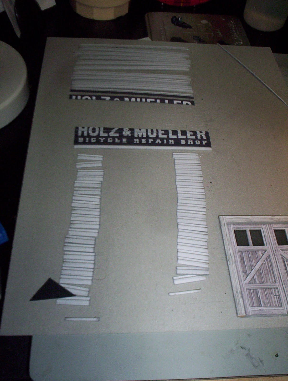
Today, I did a lot of work on the clapboard siding and front doors of the facade of the bicycle shop.

I printed two copies of the facade and glued them to shirt cardboard with some Aleene's spray adhesive -- the least expensive spray adhesive at the craft store. Then I sliced the boards so they all included a half-board on the top. Once they're glued to the facade, the overlap will create the clapboard texture.


I edged almost all of these with neutral grey gouache. When I got to the painted sign part, I carefully edged the bottoms of the letters with the neutral grey, and the spaces between the letters with a dark grey. When they're stacked on top of each other, it looks like the sign painter got the underside of the clapboards.


The doors are built up out of five layers. From bottom to top, the layers are:

     1. Windows printed on vellum,

     2. Windows printed on transparency, with glossy side facing out,

     3. Door printed on matte photo cardstock, laminated to shirt cardboard, with windows cut out,

     4. Door frame and diagonals printed on matte photo cardstock, laminated to shirt cardboard,

     5. Lintel and jambs printed on matte photo cardstock, laminated to very heavy cardboard from the backing of a sketch pad.

Here is a blurry shot of the door lit from the front:


And here's another blurry shot, this time of the door lit from behind:


 The client said he didn't want to light it, but I'm giving him the option for later.

 O scale is new to me and I'm enjoying it. It's easier in some ways than HO, because it's nearly twice the size. (181% to be exact.) It's tougher in others, because it requires more surface texture to look real.