Wednesday, November 26, 2014

More Stereo Views of My Models

 I went on a bit of a stereoscopic binge over the last few days. It occurred to me that I might document my builds in 3D both to have a record of things I've made, and it's much more portable than carrying delicate models when I meet clients.

I took these by setting the camera on the table, taking one shot, then sliding the camera about 3/4" and taking the second shot.

I printed these on 4x6 photo paper, then trimmed them to fit in a viewer I got from a book.

These are all for free-viewing. 

These two are from Discworld. First the Library:


And the High Energy Magic Building:


This is the Gorre Water Tower by Clever Models:


This is a scratch-built wooden depot, based on a Clever Models template:


Sunday, November 23, 2014

Finishing the O Scale Bike Shop

Got the last of the pieces cut out and mounted to cardboard, and assembled it today.

Here it is, dryfitted together. No floor or roof yet.


A view inside, with the window shade showing.


AAAND... the views of the completed model in 3D.

For cross-eyed viewing:


For free-viewing:


Thursday, November 20, 2014

O Scale Bike Shop Facade Finished

The clapboards look as nice as I'd hoped. The rest of the building is much simpler, and ought to take about as long as I spent on the facade.


Wednesday, November 19, 2014

O Scale Bike Shop Build Continues...

Today, I did a lot of work on the clapboard siding and front doors of the facade of the bicycle shop.

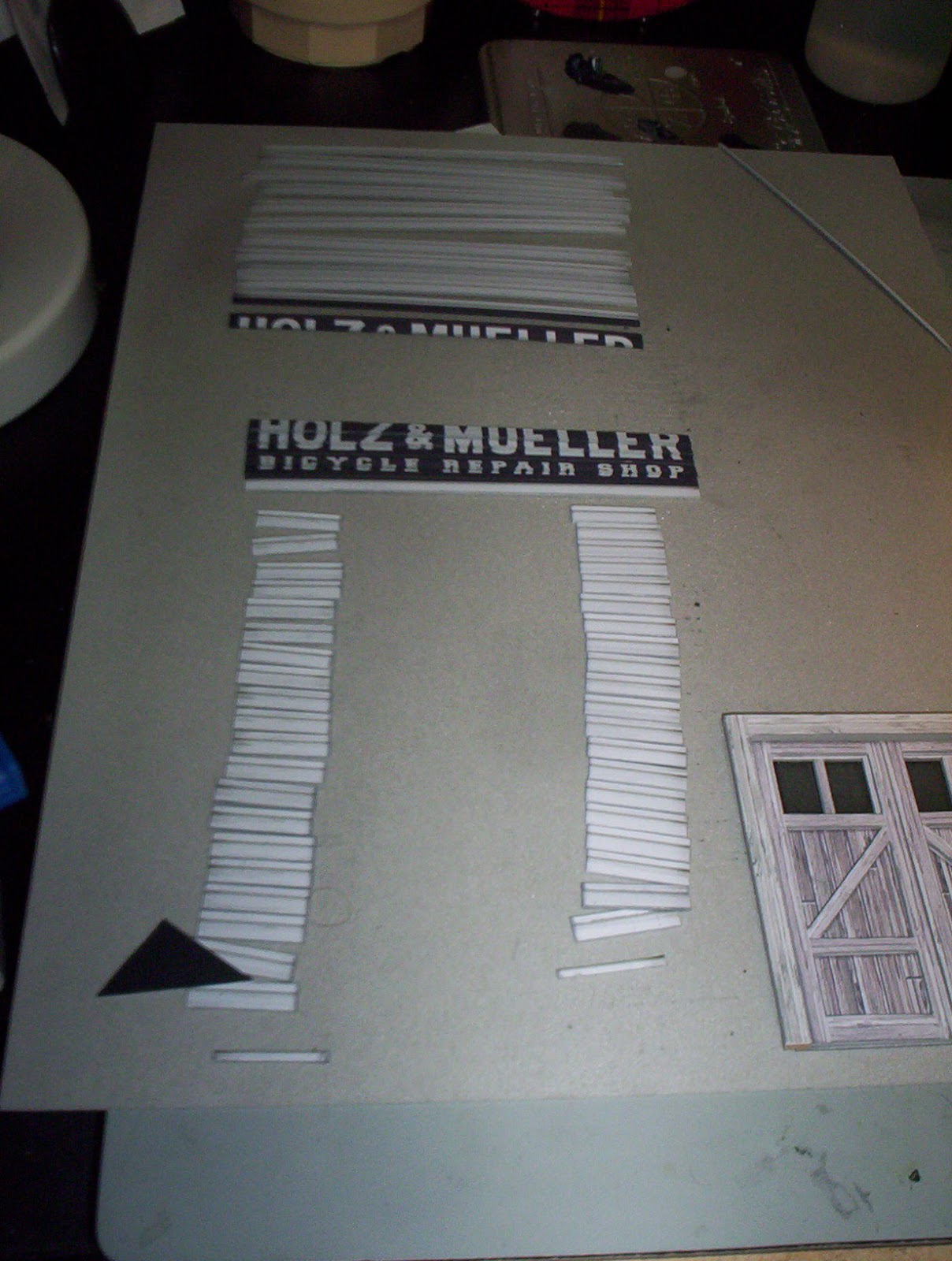
I printed two copies of the facade and glued them to shirt cardboard with some Aleene's spray adhesive -- the least expensive spray adhesive at the craft store. Then I sliced the boards so they all included a half-board on the top. Once they're glued to the facade, the overlap will create the clapboard texture.


I edged almost all of these with neutral grey gouache. When I got to the painted sign part, I carefully edged the bottoms of the letters with the neutral grey, and the spaces between the letters with a dark grey. When they're stacked on top of each other, it looks like the sign painter got the underside of the clapboards.


The doors are built up out of five layers. From bottom to top, the layers are:

     1. Windows printed on vellum,

     2. Windows printed on transparency, with glossy side facing out,

     3. Door printed on matte photo cardstock, laminated to shirt cardboard, with windows cut out,

     4. Door frame and diagonals printed on matte photo cardstock, laminated to shirt cardboard,

     5. Lintel and jambs printed on matte photo cardstock, laminated to very heavy cardboard from the backing of a sketch pad.

Here is a blurry shot of the door lit from the front:


And here's another blurry shot, this time of the door lit from behind:


 The client said he didn't want to light it, but I'm giving him the option for later.

 O scale is new to me and I'm enjoying it. It's easier in some ways than HO, because it's nearly twice the size. (181% to be exact.) It's tougher in others, because it requires more surface texture to look real.

Monday, November 17, 2014

O Scale Bike Shop Modifications.

Started work on another of Clever Models' fine products. This time, I'm working in O scale, which is going to be a cinch after doing so many HO and N scale models. I'm modifying their cycle shop with a change of signage to push the era back to the 1890s.

Here's the original:


Per my client's request, here are my modifications to the facade:


The lettering for HOLZ & MUELLER is set in an Egyptian font I found in a vintage book for sign painters. BICYCLE REPAIR SHOP was set in an academic/sports font I found online. Slab serifs were pretty common in that era. 

All the posters were found online, and I've printed them on cigarette paper so the thickness will look alright when I peel up the corners a little. I printed the Raleigh and Fowler signs on glossy photo paper so they'll look a bit like enamel signs.

More to follow as the build progresses.

Saturday, November 1, 2014

The 387 Paper Model Houses of Peter Fritz

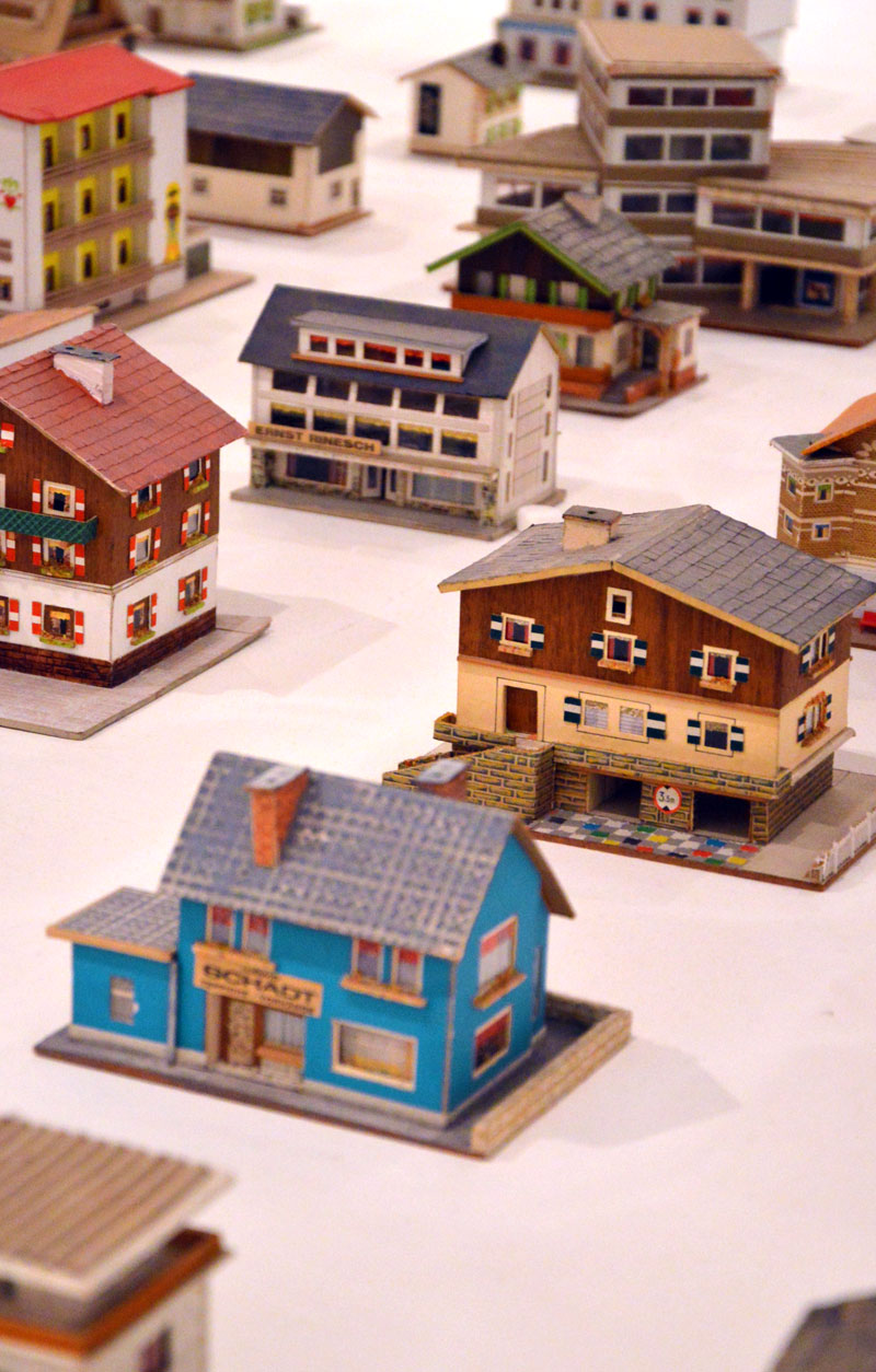
 Here's a set of inspirational miniature buildings, made out of odds and ends and not based on any particular real buildings. After the creator's death, someone found these in a junk shop.  

The Imaginary Town of an Unconscious Architect: The 387 Paper Model Houses of Peter Fritz

Wednesday, October 29, 2014

Ghost Signs for Cardstock Models using The Gimp

Inspired by the Fading Ad Blog, I tried my hand at creating a couple ads to drop onto a Clever Models texture sheet.


The Harold Lloyd sign on the top may seem unlikely -- why have a painted sign for a movie that might only run a few weeks? -- but it is based on an actual sign re-discovered a few years ago in Vancouver, B.C. when another building was torn down.


Seems the theater owner knew a building was going up and decided he could splash out with a painted sign. I changed a few things like the theater name and some colors, but I tried to match the fonts fairly closely.

 The second is my very liberal interpretation of an actual sign; the real sign used much less decorative fonts. This is always a decision you get to make when you're designing -- do I want it to look authentically old-time, or should I go for more of a modern idea of what "old-timey" is supposed to look like? Generally, the past was less fancy than we think, but sometimes I throw reality to the wind, because I like to fool around with fonts.

Here is how they look when I drop them on top of the Clever Models texture and lower the opacity of the sign layer.


 If I'm modeling a later era, I can lower the opacity still more to simulate further fading.


I got to fooling around with this, and decided I wanted to create the effect of a recently painted wall, which would make sense with that Harold Lloyd sign, since it was only supposed to be visible for a short time. Creating this effect is tricky using this technique -- by the time you drop the opacity just enough to see the wall (around 75% to 80%) you've created the illusion the paint has faded for quite a number of years.  But it's not impossible. The first step of the workaround is this:


(1) Copy two parts of the brick background that correspond to the areas covered by the painted signs, and (2) paste them as a new layer. Then (3) desaturate the colors to bring them down to greyscale, (4) invert them to make the dark areas light and light areas dark, and finally (5) adjust the brightness and contrast to make the shadows really pop.

Now when you make the translucent sign layer visible on top of this "white paint," it causes the the whites and light colors appear freshly painted, but you can still see a brick texture through them.


Naturally, all this works with Photoshop, too.