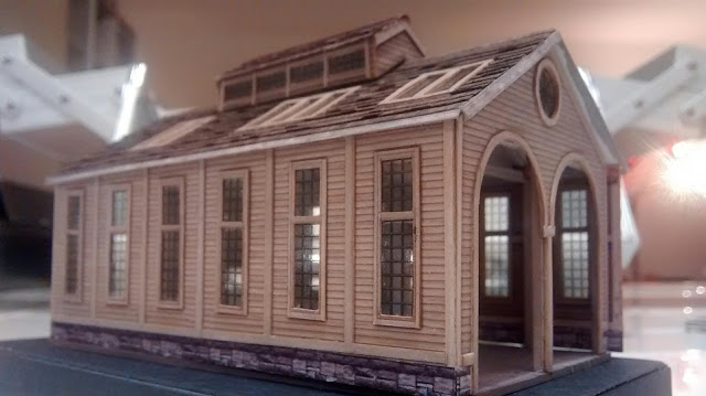
COMIC SANS!?
How could you spend all that time designing, building and detailing that building and then just slap COMIC SANS on it?
(UPDATE 5/22/16: I found a copy of Typography for the People: Hand-Painted Signs from Around The World (Plus 15 Free Fonts) by Daniel Bellon at a thrift store for under $5. I modified the image above with a font called Bellon Square, which has the kind of letters that might actually be used by someone who hand-paints signs like this...)
I have a few rules about fonts for model structures...
FONT RULE #1: Don't Use Comic Sans.
(There are lots of other fonts you shouldn't use on structure models, but just never use Comic Sans for anything, ever.)
FONT RULE #2:
Don't Confuse Print or Screen Fonts with Signage Fonts.
(Print fonts are designed so the ink won't blob up where the lines join. Screen fonts are designed to look nice on your computer. Signage fonts are designed to be read and understood instantly at a distance.)
FONT RULE #3:
Use All Caps.
Use All Caps.
(Names of businesses were almost never set in upper and lower case.)
EXCEPTION TO FONT RULE #3:
Don't Use All-Caps With Script or Old English Fonts.
(Unless you're getting a prison tattoo or recreating modern graffitti.)
Old English set in all caps is a hallmark of
Southern Californian Chicano culture,
but isn't appropriate for signage.
(By the way, I really like this!)
FONT RULE #4:
Don't Use a Curved Baseline to Make It Look "Old Time-y."
(Most old signs on buildings were designed to be legible at a distance, not fancy. Curved baselines were mostly used in print and on packaging, and only very, very seldom on signs. I love Bar Mills models, but they get this wrong consistently.)
This is an authentic, vintage curved baseline, from a
Sanborn Map, which would be really difficult to recreate,
and would never appear on the side of an actual building.
This is an ugly example of using a curved
baseline to make something look old time-y.
A Bar Mills model. A fine-looking structure,
but the font is a print font, and there's a curved
baseline on the 2nd"Amos Cutter", and again on
"General Merchandise." Don't try too hard to make
something look old fashioned!
but the font is a print font, and there's a curved
baseline on the 2nd"Amos Cutter", and again on
"General Merchandise." Don't try too hard to make
something look old fashioned!
FONT RULE #5
Don't Stretch a Line of Text to Make It Fit
(This changes the line weights, and makes the letters look all wrong. If you stretch side-to-side, the downstrokes get thicker; up-and-down stretching thickens the horizontal lines. Look for fonts that fit the space you want to fill without distortion.)
FONT RULE #5a
Don't Stretch Pictures, Either.
(I wrote about this, here.)
FONT RULE #6:
The Fonts You Want: Sign Painter's Egyptian and Various Slab Serif.
(I've yet to find the former in a free font format, so I cut-and-paste from scans I've found online. The line weight doesn't change where the lines meet, and the reason for that is the technique sign painters used to paint letters: by rotating the brush as they went along. This makes the line weights different from calligraphic fonts, where the nib of the pen is typically held at the same angle while the letter is drawn, creating thick and thin lines. Slab Serif or "Block" fonts are used nowadays mostly for collegiate sports, but they were used for signs in the early 20th century.)
From Henderson's Sign Painter by John G. Ohnimus
UPDATE: Here's a link to an inexpensive ($6) version of a sign painters' Egyptian font!
UPDATE: Here's a link to an inexpensive ($6) version of a sign painters' Egyptian font!
FONT RULE #6:
Read Antique Sign Painters' Guidebooks.
(See above.)
FONT RULE #7:
Signage from the Late 19th Century Always Ended with a Period.
(I don't know why; it just did. This trend lasted until about the 1920s. See the quote below, from Elements of Lettering and Sign Painting, 1899...)
FONT RULE #8:
Do Look at a Lot of Old Photos.
(Any book from Arcadia Publishing is a good starting point. Arcadia's books are photo-heavy, so you will almost certainly find examples of signs from whatever era you're modelling. As a bonus, they'll be specific to the area you're building.)
FONT RULE #8a
There Were a Lot of Sign Painters Who Didn't Know the Rules.
I'm forever finding old photographs of really bad signs. Zoom in on the sign on the mill, and you'll see the letter spacing is so bad, it reads "ILWACOMILL &LUMBERCO." Y'know, I think it would be okay to redesign that sign, even if it is a change from the prototype. That sign painter didn't know what the hell he was doing.
Just because a sign painter got it wrong, you don't have to...
FONT RULE # 9:
There Are Lots of Free Fonts Out There. Go Get Some!
(DaFont, 1001 Free Fonts, etc.)


