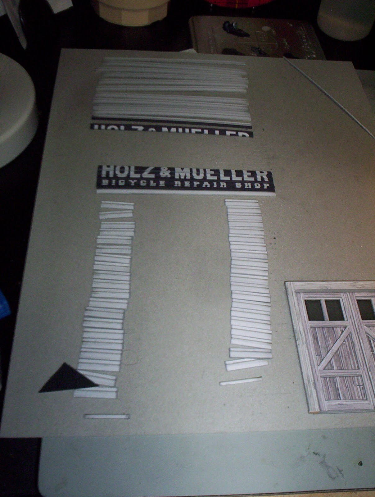
Today, I did a lot of work on the clapboard siding and front doors of the facade of the bicycle shop.
I printed two copies of the facade and glued them to shirt cardboard with some Aleene's spray adhesive -- the least expensive spray adhesive at the craft store. Then I sliced the boards so they all included a half-board on the top. Once they're glued to the facade, the overlap will create the clapboard texture.
I edged almost all of these with neutral grey gouache. When I got to the painted sign part, I carefully edged the bottoms of the letters with the neutral grey, and the spaces between the letters with a dark grey. When they're stacked on top of each other, it looks like the sign painter got the underside of the clapboards.
The doors are built up out of five layers. From bottom to top, the layers are:
1. Windows printed on vellum,
2. Windows printed on transparency, with glossy side facing out,
3. Door printed on matte photo cardstock, laminated to shirt cardboard, with windows cut out,
4. Door frame and diagonals printed on matte photo cardstock, laminated to shirt cardboard,
5. Lintel and jambs printed on matte photo cardstock, laminated to very heavy cardboard from the backing of a sketch pad.
Here is a blurry shot of the door lit from the front:
And here's another blurry shot, this time of the door lit from behind:
The client said he didn't want to light it, but I'm giving him the option for later.
O scale is new to me and I'm enjoying it. It's easier in some ways than HO, because it's nearly twice the size. (181% to be exact.) It's tougher in others, because it requires more surface texture to look real.


