Wednesday, October 29, 2014

Ghost Signs for Cardstock Models using The Gimp

Inspired by the Fading Ad Blog, I tried my hand at creating a couple ads to drop onto a Clever Models texture sheet.


The Harold Lloyd sign on the top may seem unlikely -- why have a painted sign for a movie that might only run a few weeks? -- but it is based on an actual sign re-discovered a few years ago in Vancouver, B.C. when another building was torn down.


Seems the theater owner knew a building was going up and decided he could splash out with a painted sign. I changed a few things like the theater name and some colors, but I tried to match the fonts fairly closely.

 The second is my very liberal interpretation of an actual sign; the real sign used much less decorative fonts. This is always a decision you get to make when you're designing -- do I want it to look authentically old-time, or should I go for more of a modern idea of what "old-timey" is supposed to look like? Generally, the past was less fancy than we think, but sometimes I throw reality to the wind, because I like to fool around with fonts.

Here is how they look when I drop them on top of the Clever Models texture and lower the opacity of the sign layer.


 If I'm modeling a later era, I can lower the opacity still more to simulate further fading.


I got to fooling around with this, and decided I wanted to create the effect of a recently painted wall, which would make sense with that Harold Lloyd sign, since it was only supposed to be visible for a short time. Creating this effect is tricky using this technique -- by the time you drop the opacity just enough to see the wall (around 75% to 80%) you've created the illusion the paint has faded for quite a number of years.  But it's not impossible. The first step of the workaround is this:


(1) Copy two parts of the brick background that correspond to the areas covered by the painted signs, and (2) paste them as a new layer. Then (3) desaturate the colors to bring them down to greyscale, (4) invert them to make the dark areas light and light areas dark, and finally (5) adjust the brightness and contrast to make the shadows really pop.

Now when you make the translucent sign layer visible on top of this "white paint," it causes the the whites and light colors appear freshly painted, but you can still see a brick texture through them.


Naturally, all this works with Photoshop, too.

BLOGROLL: The Fading Ad Blog

Quickly becoming one of my faves is The Fading Ad Blog, which documents old signage. Lots of useful examples of ghost signs, billboards and other signs.


Miniature of Winchester in the 1870s Needs a Home

A 15' model of Winchester in the 1870s goes back into storage after being displayed this month. Its creator, Roger Brown, says he's searched for a place to display it permanently since its completion twenty five years ago.

Are those the faint echoes of Langweil's model of Prague I hear?

Sunday, October 26, 2014

1/87 Mountain Goat

I made this because I'm surprised to learn that there is practically no HO scale American wildlife available.

Sculpey & Liquid Sculpey on an aluminium armature, painted with acrylic.

Pretty rough sculpt, but it is very small. There's a bit of a penny in the lower left for scale.


Monday, October 20, 2014

Waiting for a big project...

I'm waiting on a big project to start early next year, and I figured I'd use the time to improve my workbench a bit. I've been watching a lot of how-to videos, and noticed a lot of people had some sort of shallow shelf to keep their paint and glue close at hand. Using a piece of scrap black plastic, I threw this together in about 45 minutes, not counting the time spent waiting for the glue to set. I used Shoe Goo, because that stuff is pretty tough.


It's nothing fancy, but it will hold larger bottles on the top shelf, and small paint bottles on the bottom.

Wednesday, October 15, 2014

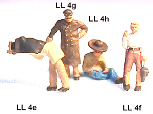
Transition Era Figures

Tough to find, the little boogers.

Musket Miniatures has sculpts that are pretty rough, but a pretty good range of different people in lively poses. For some reason, the figures are found under "CATALOG" and "Rustic Rails" -- I wonder how many customers they lose by not having the figures under a link called "Figures"? The site also lacks photos of a lot of their line.


Scale Figures also has rough figures, but a very nice range of people and poses. Why they think I want to click on a link to HO figures to see a list of figures, THEN click on a link for some of those figures and THEN click on an image of a group of figures to see what they look like... well, the mysteries of model railroad suppliers' web sites run deep.


While I'm crabbing about model railroad suppliers' web site design... Last night I found a nice long links page and I clicked on all of them. Repeatedly, I came across the following annoyances:
  • Search results below the fold. Don't know how that's a thing, but it is. It's as if a customer came in your store, asked to see a product, and you showed it to her under a marble countertop.
  • Long-winded pages that required me to scroll down, down, down before they showed me any products. I encountered everything from essays on why they could no longer offer product X (before they showed me any products) to wedding announcements and other personal stories.
  • Pages where every single item in the product line was "SOLD OUT."
  • Front pages where I searched and searched around for a link to their product line, only to discover a small "ENTER SITE HERE" button... below the fold.
  • Music that started automatically.
  • Sites that insisted I download fonts to make their pages display properly.
  • Sites that insisted I download a PDF catalog... and a PDF price list (to cross-reference them myself)... and then a PDF order form, which I was supposed to print and mail in with a check. I know they're old, but that's just about every barricade they could put between themselves and my money.
  • Conversely, there were a couple sites that had a big announcement that their online shopping cart was working... at last! (That doesn't inspire confidence...)
  • Sites with their links named so whimsically that there was no guessing where they might lead.
Some sites had two or three of these problems.

Okay, I'm done crabbing. For now.