Sunday, October 26, 2014

1/87 Mountain Goat

I made this because I'm surprised to learn that there is practically no HO scale American wildlife available.

Sculpey & Liquid Sculpey on an aluminium armature, painted with acrylic.

Pretty rough sculpt, but it is very small. There's a bit of a penny in the lower left for scale.


Monday, October 20, 2014

Waiting for a big project...

I'm waiting on a big project to start early next year, and I figured I'd use the time to improve my workbench a bit. I've been watching a lot of how-to videos, and noticed a lot of people had some sort of shallow shelf to keep their paint and glue close at hand. Using a piece of scrap black plastic, I threw this together in about 45 minutes, not counting the time spent waiting for the glue to set. I used Shoe Goo, because that stuff is pretty tough.


It's nothing fancy, but it will hold larger bottles on the top shelf, and small paint bottles on the bottom.

Wednesday, October 15, 2014

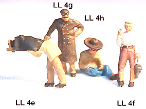
Transition Era Figures

Tough to find, the little boogers.

Musket Miniatures has sculpts that are pretty rough, but a pretty good range of different people in lively poses. For some reason, the figures are found under "CATALOG" and "Rustic Rails" -- I wonder how many customers they lose by not having the figures under a link called "Figures"? The site also lacks photos of a lot of their line.


Scale Figures also has rough figures, but a very nice range of people and poses. Why they think I want to click on a link to HO figures to see a list of figures, THEN click on a link for some of those figures and THEN click on an image of a group of figures to see what they look like... well, the mysteries of model railroad suppliers' web sites run deep.


While I'm crabbing about model railroad suppliers' web site design... Last night I found a nice long links page and I clicked on all of them. Repeatedly, I came across the following annoyances:
  • Search results below the fold. Don't know how that's a thing, but it is. It's as if a customer came in your store, asked to see a product, and you showed it to her under a marble countertop.
  • Long-winded pages that required me to scroll down, down, down before they showed me any products. I encountered everything from essays on why they could no longer offer product X (before they showed me any products) to wedding announcements and other personal stories.
  • Pages where every single item in the product line was "SOLD OUT."
  • Front pages where I searched and searched around for a link to their product line, only to discover a small "ENTER SITE HERE" button... below the fold.
  • Music that started automatically.
  • Sites that insisted I download fonts to make their pages display properly.
  • Sites that insisted I download a PDF catalog... and a PDF price list (to cross-reference them myself)... and then a PDF order form, which I was supposed to print and mail in with a check. I know they're old, but that's just about every barricade they could put between themselves and my money.
  • Conversely, there were a couple sites that had a big announcement that their online shopping cart was working... at last! (That doesn't inspire confidence...)
  • Sites with their links named so whimsically that there was no guessing where they might lead.
Some sites had two or three of these problems.

Okay, I'm done crabbing. For now.

Saturday, September 27, 2014

Speeder Shed Mistake

I didn't double-check the measurements before I started building, and I learned too late that my printer once again decided what was best for me -- shrinking the 8.5" x 11" image down to fit in the printer margins. I worked for two afternoons on this model before I checked the size of the footprint and realized I wasn't working in HO scale at all. This is too big to be N scale, and too small for HO.

AARRRGH!


 The details came out looking very good, though. Maybe someone will want it for a forced perspective illusion on a layout.


Friday, September 5, 2014

Ghostbusters' Firehouse in N-Scale (1/160)

In preparation for the upcoming Mini Maker Faire, I built the Ghostbuster's headquarters. In addition to scaling it down, I made a few mods to the original model (found here). I glued the whole thing to some heavy black cardstock and simply cut out the windows rather than building the elaborate window boxen provided. The heavy cardstock added some needed thickness to the detailing pieces.


At this scale tiny boxen tend to look pretty bad because you have so many angles you could get slightly wrong, so in order to make the sign, I laminated several pieces of heavy card and sandwiched the Ghostbusters logo inside some frame pieces. Then I cut the outer edge all at once. It's a solid thing rather than a hollow box.


 One very nice touch from the designer: the detailing pieces function as tabs on the outside of the model -- I thought that was pretty clever.

Also, the cornice details pull the 45 degree mitred edges together very nicely so there's no gap.

 Hopefully some kids will recognize it. I donno, do kids even watch Ghostbusters any more?

Tuesday, August 5, 2014

This Drives Me Crazy!

I'm a bit of a perfectionist, I'll admit it. When I design signs for miniature work, I take pains to make them look as good as I can. I've been working on some papercraft billboards, and hunting around online for graphics that fit properly in the allowable space.

Here is what my billboard will look like.


I found a few nice examples of images that fit in that space, and I also found one that sort of fit, but not quite.


That's a great sign, with a great slogan, but when I copied it into my billboard, it left a little too much white space on either side. (There's some white space on the billboard above, too, but somehow, it looked wrong to me on my ground-level billboard.)


Now the lazy way to fix this problem is to simply distort the image from side to side... which I never do. When you do that, it makes faces look too wide, it ruins the typography, and it's just the wrong thing to do.

What I did was: I cut all the elements out and made new layers of them. Then I made a pale yellow backdrop of the correct dimensions, and I moved and resized all the elements to fit in the new space.


 Now, I'm not going to name and shame the HO scale sign manufacturer who doesn't do this  (I suppose any reasonably clever reader could Google around and figure out who it is) but here's an example of how NOT to do it.

Take your existing circus poster...


And then squash it down to fit your billboard.


Just look what happens. All the lettering is fat and squished, and the gorilla looks too squat. Why anyone would think this looks authentically vintage is beyond me -- it's so obviously distorted by a modern graphics program. And the company selling these says they're for circus savvy customers.

The moral to all this is: resize, don't distort!